By: JOHN METCALFEand originally published hereThe National Weather Service has an experimental new tool that shows the weather hazards along your journey, including predicted snow accumulations.Foul winter weather is moving over the East Coast. (NASA/GOES)
A swollen storm with lousy timing is lurching toward the U.S. East Coast this Thanksgiving, and the implications for travel are worrying. With 1 to 3 inches of snow predicted for the I-95 corridor by Wednesday night (and up to 6 inches farther west), it's easy to gnaw fingernails over a possible commuter ant-crawl, littered with stalls, wrecks, airline delays, rage, and all the other fun ingredients of a mass-migration kerfuffle.
The National Weather Service office in Philadelphia says to "expect flight delays" and trouble on the roads, and is advising people finish their journeys "before 7 AM Wednesday morning." (Meaning if you haven't left yet, better get cracking now). "Conditions will be quickly deteriorating Wednesday evening,"adds the agency's bureau in Gray, Maine. "We anticipate travel will be very difficult around that time." New York cuts right to the point with this: "THE SNOWFALL WILL SIGNIFICANTLY IMPACT HOLIDAY TRAVEL... MAKING DRIVING DANGEROUS AT TIMES."
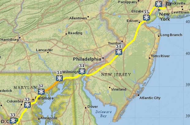
Here's a forecast of accumulations from the NWS Weather Prediction Center, with pink-and-red the areas having a high probability of getting two-or-more inches of snow from this storm:
How could this nasty weather affect your holiday commute? To answer that question, you might want to check out an experimental travel tool the NWS isnow promoting. The "Enhanced Data Display v4.3.2" allows you to plot a road trip from Point A to B while giving the expected conditions at intervals along the way. For instance, here's the route a driver might take to New York departing from D.C. at 2 p.m. Wednesday:
Hover the mouse over the weather icons inside the tool itself and a window pops up with worst case-scenario forecasts and warnings. By the time the motorist gets to Baltimore, there could be 2 inches of snow on the ground, wind gusts nearing 20 mph, and a visibility of 2 miles. Arriving on New York's doorstep in Union City, New Jersey, the motorist might find conditions have worsened to 3.3 inches of snow, 29 mph gusts, and a Winter Weather Advisoryin effect.
Being a prototype, the tool isn't perfect: Its "forecast valid" data are, for now, shown in Coordinated Universal Time (though the weather predictions are displayed correctly in local time). And its estimations of arrival times are wildly optimistic for a snow day—there's no way in icy hell that drivers will get from D.C. to New York in under four hours Wednesday afternoon. Still, as a means to glimpse the suffering this storm could sow across the region, it makes a pretty nifty crystal ball.
The paradox of the American Dream: The best cities to get ahead are often the most expensive places to live, and the most affordable places to live can be the worst cities to get ahead. Salt Lake City, pictured, is the one of the rare cities that scores highly on two separate measures of housing affordability and upward mobility. (Wkimedia Commons)
So what'll it be: Dayton or San Francisco?
Alright, so that's not the most common choice for young people getting ready to start their lives. But it's an instructive question.
Dayton is the most affordable housing market in the United States, according to Trulia chief economist Jed Kolko, while San Francisco is the least affordable place to live in America. But the San Francisco-San Jose area has a better record of social mobility than just about any region in the country, according to Harvard economist Raj Chetty. In other words, a variety of factors make it the best place for young person to work his or her way into the middle class and beyond. As for Dayton and other Ohio cities, they account for four of the 12 worst cities for that same measure of upward mobility.
The Dayton-SF dilemma isn't about Ohio vs. California. It's about a broader dilemma for young workers and, in particular, young couples looking to buy a home, raise children, and achieve the American Dream. The cities with the least affordable housing often have the best social mobility. And the cities with the worst social mobility often have the most affordable housing. When good jobs for the middle class and affordable homes are living in different cities, it represents a slow-motion splintering of the American Dream.
In 2013, Chetty and a phalanx of economists produced a one-of-a-kind study on intergenerational mobility—that is, the odds that low-income households can work their way into the middle class and above. Comparing social mobility by metro area, they discovered that the American Dream is alive in many cities, such as Salt Lake City, Pittsburgh, and San Jose. But it's dying in others, particularly across the southeast and the Rust Belt, where cities are spread out, segregated, and blighted by bad schools and broken families.
But most young people aren't choosing to move to a city because they've heard that a Harvard economist said it was really good for intergenerational mobility. They move for more short-term financial reasons. They want to live affordably. As Kolko explains, "the five most affordable markets are in Ohio, Indiana, and upstate New York... the South is relatively affordable, too."*
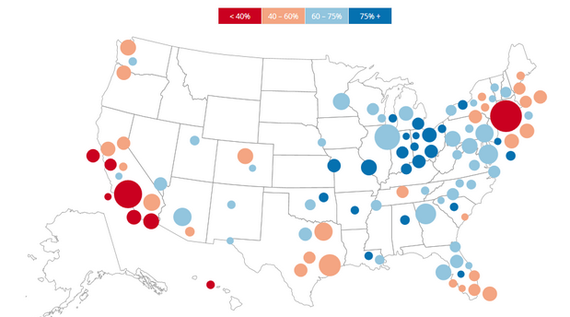
But now look what happens when you compare Chetty's map of economic opportunity (red is bad) ...
Economic Opportunity, by Location
(Chetty)
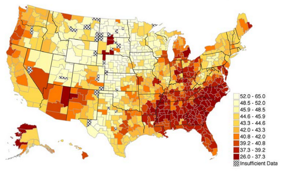
with Kolko's map of affordable housing by city (red is still bad).
Percent of For-Sale Homes That Are Affordable With a Median Household Income
(Kolko/Trulia)
Climbing the income ladder is easiest in the West and Northeast. But finding an affordable home is easiest in the South and the Great Lakes/Appalachian region. California, home to six of the seven least-affordable housing markets, has four of the 11 best cities for upward mobility.
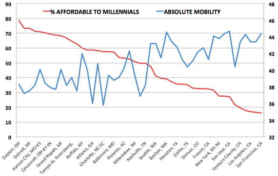
If you plot the 50 largest metro areas by Kolko's affordability metric and Chetty's absolute mobility metric, the inverse relationship is unavoidably clear. Upwardly mobile cities have more expensive homes.
Percent of Homes Millennials Can Afford vs. Social Mobility
The X-axis includes the names of only some of the cities recorded here. The graph does not include the three outliers discussed in the next paragraph: Salt Lake City, Pittsburgh, or Minneapolis. (Kolko/Chetty)
There are the only three cities in the United States with (a) at least 50 percent of houses affordable to middle-class Millennials and (b) a top-10 finish in Chetty's mobility calculations. These are the outliers: Pittsburgh, Minneapolis, and Salt Lake City.
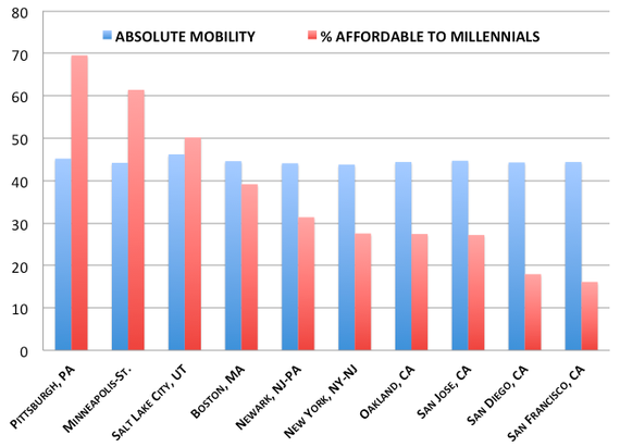
In the graph below, I've isolated the 10 best cities for upward mobility and arranged them by affordability to give you a sense of how steep the drop-off is after our trio of outliers. Less than half of all homes are affordable to middle-class Millennials in Boston, NYC, and across California's major metros, all of which are sterling cities for working your way into and past the middle class.
Top 10 Cities for Social Mobility, Ranked by Affordability
(Chetty/Kolko)
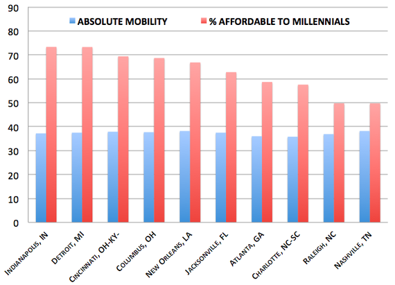
Here are the 10 major U.S. cities with the worst upward mobility by Chetty's measure. I've arranged them by Kolko's affordability metric again. What stands out immediately: More than half of the houses in all of these cities are affordable for young families. (These are all major metros, and the worst places for upwardly mobility could well be in exurban and rural America.)
Bottom 10 Cities for Social Mobility, Ranked by Affordability
(Chetty/Kolko)
Lots of graphs, lots of colors, but this is a pretty simple conclusion. The American Dream begins with a good job and place to live that you can afford. But today, those two halves of the American Dream are living apart. The good jobs and high wages are in unaffordable cities. The affordable homes cluster in the cities with lower wages and less upwardly mobile families.
Kolko offers a sensible explanation:
High-income households bid up home prices, and high prices push out lower-income households. In addition, higher-income metros tend to have less new construction than lower-income metros do. As a result, high-income metros such as San Francisco and San Jose are among the least affordable, even after taking income into account ... Bucking the trend are Washington, D.C., and the Bethesda metro next door, where incomes are high and more than 60% of homes are within reach of the middle class.
Until more rich coastal cities find ways match the income growth of their residents with more housing development, the best advice for young people seeking the American Dream isn't "Go West, young man" or "Go East, young woman." It's "Check out Pittsburgh, Minneapolis, and Salt Lake City." *Kolko calls a house affordable when "total monthly payment, including mortgage, insurance, and property taxes, is less than 31 percent of the metro area’s median household income" for Millennial-headed households. Millennials is defined as adults under 35. This post originally appeared on The Atlantic.